
When voters are ready to give but your donation page stops them, it’s more than just a missed opportunity. In fact, it becomes a preventable loss—one that could have been avoided with the right setup.
Most county donation pages aren’t built to convert. They’re outdated, unclear, and full of friction. That means people leave before they finish.

Let’s change that.
We’ve audited dozens of GOP county sites. These three quick fixes are what we’ve used to help counties like Brown County, Wisconsin and Comanche County, Oklahoma double their online donations in a single cycle.
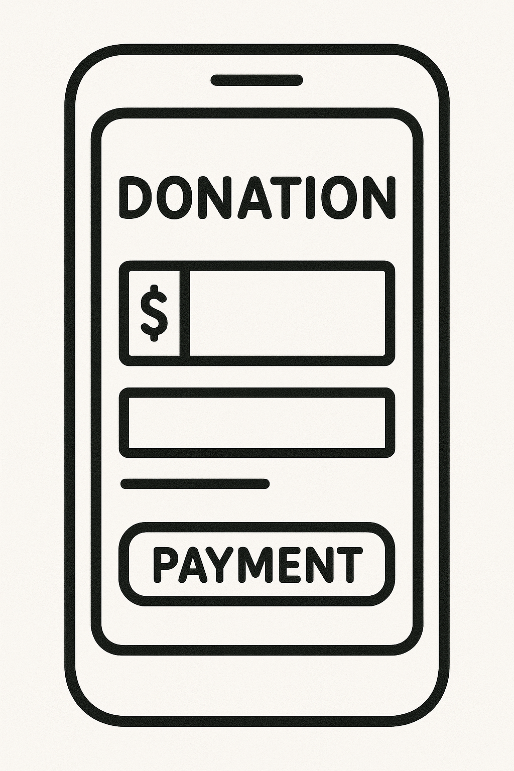
Fix #1: Simplify the Page Layout
This is where 90% of counties go wrong. The donation page should feel like a one-way street—not a rabbit hole. Most donation pages are cluttered with too many options, too many links, and way too much text. That’s friction—and friction kills conversions.
Your page’s only job is to move a motivated donor across the finish line—fast.
Here’s how to strip it down to what works:
✅ Remove the navigation bar completely. You don’t want donors clicking back to “Events” or “About Us.”
✅ Eliminate any footer links or secondary menus. Those are just escape hatches for distracted users.
✅ Keep the layout singularly focused on the donation action—with no side content, no social media embeds, and no newsletter pop-ups.
The psychology here is simple—less distraction equals more action. When a page has only one possible next step, users are far more likely to take it.
Start with a fast-loading, clearly branded header. Make sure it reinforces who you are (ex: “Pulaski County Republican Committee”) and includes a subtle, high-contrast visual brand identity.
Then, instead of dumping a block of text, use 2–3 short, emotional sentences to frame the ask:
“We’re fighting for school board accountability, and your gift fuels the next 1,000 voter contacts. Chip in before Friday and help us finish strong.”
Follow that with suggested giving tiers. Structure the buttons with 4–6 fixed amounts ($10, $25, $50, $100, $250, Other), and default the user to a mid-tier number (usually around $35–75 depending on your county’s average).
Most importantly—include a recurring toggle set to ON by default. The difference between one-time and monthly donors is operational scale. The best counties are building base-level recurring pipelines because they engineered their donation flow to encourage it.
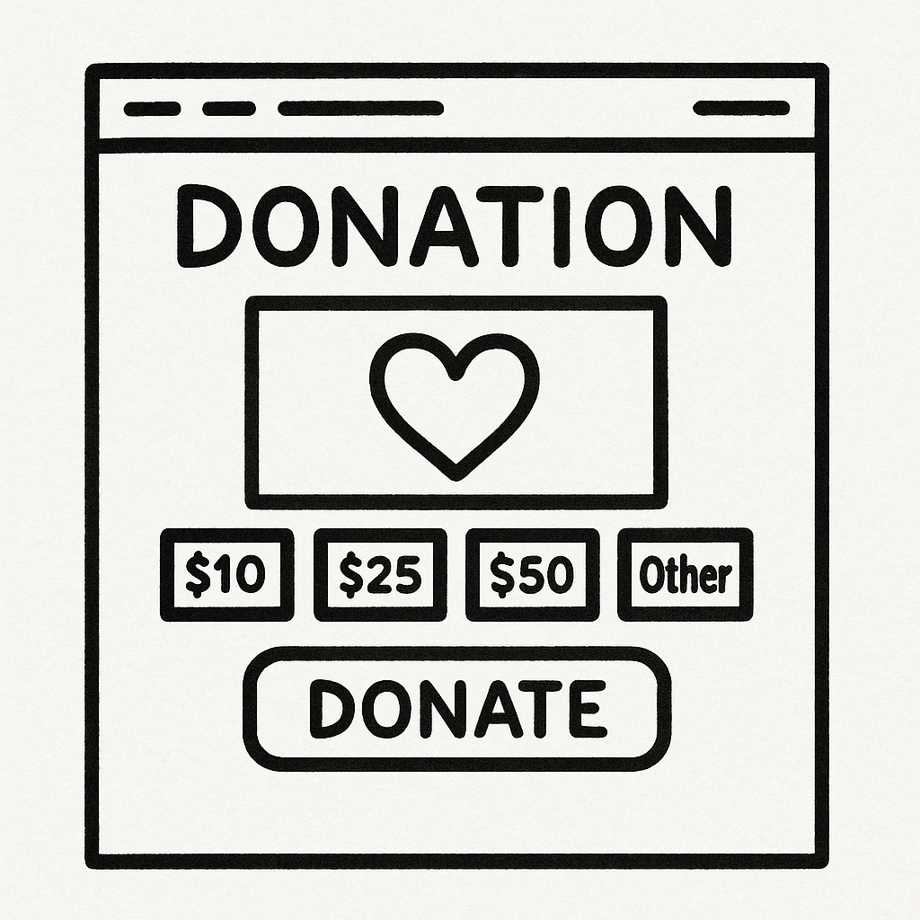
Wrap it up with one bold, unmistakable call-to-action button that fills the width of the screen. “Donate Now” is fine. But test variants like:
- “Fuel the Fight”
- “Join the Monthly Club”
- “Send Support Before Midnight”
Whatever you use—make sure it’s visible, high-contrast, and immediately clear.
One purpose. One pathway. No confusion. This is how small-dollar conversion gets built.
We created this guide on how to maximize your County GOP’s website pages.
Download the County Party Playbook
Maximize, Grow and Win With Our Battle-Tested, 130+ Page, 30+ Resource County Party Playbook.
Fix #2: Use Urgency + Specificity in Your Ask
You wouldn’t ask for a vote by saying “Support democracy.”
So don’t ask for money by saying “Support our mission.”
Generic appeals fall flat. They don’t move dollars, and they don’t inspire action. Why? Because they feel optional. Like background noise.
Donors respond to urgency and specificity. When they know exactly what their gift will accomplish—and why it matters right now—they act.
Try this:
- “$50 puts a volunteer on the doorstep of 100 voters.”
- “$10 helps print materials for our local school board candidates.”
- “$250 locks in our October mail campaign.”
These messages convert because they give donors a mental image. They can see their dollars at work.
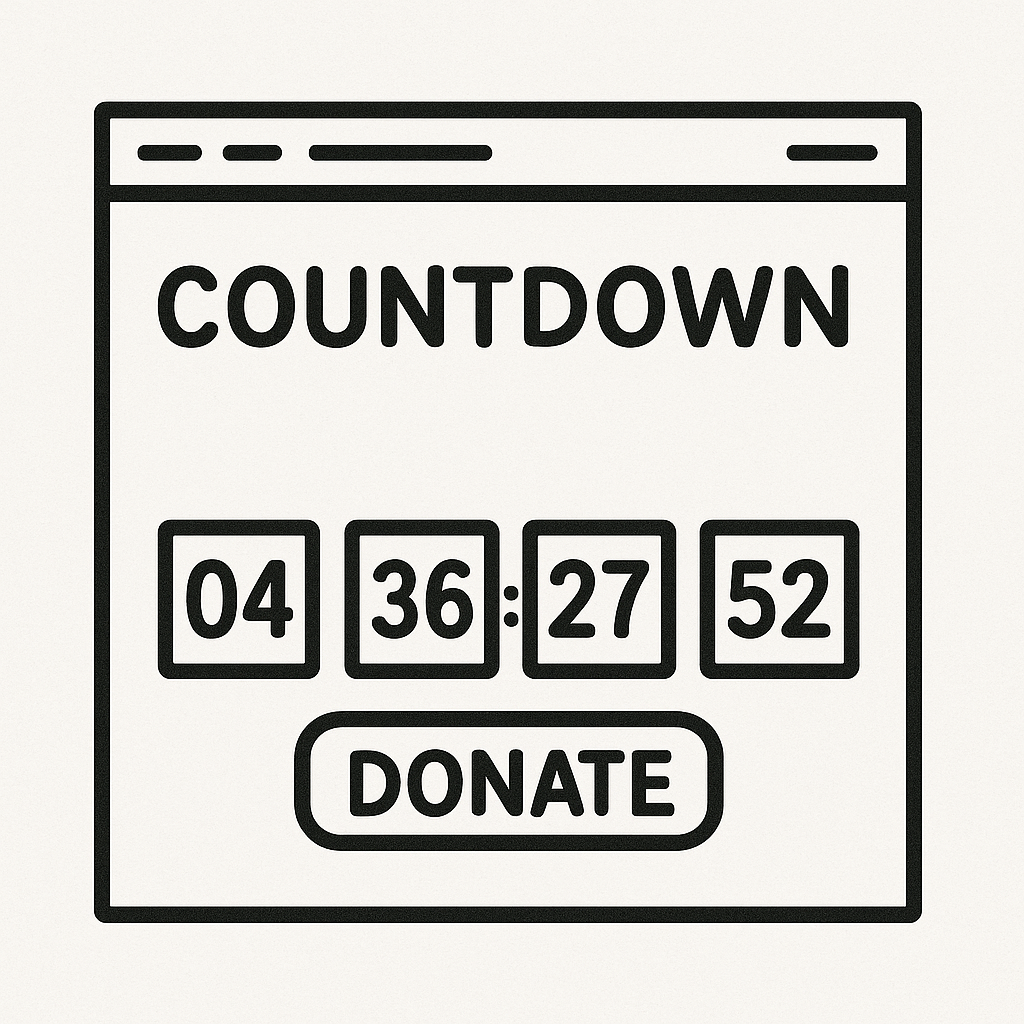
Even better? Pair that specificity with time-bound language:
- “Donate before midnight to double your impact.”
- “We’re $842 short of our precinct goal. Can you close the gap?”
- “Help us hit our 48-hour match and unlock $2,500 in pledged funds.”
Urgency makes the ask feel important. Specificity makes it believable.
We implemented this strategy in Comanche County, OK, with a three-email push tied to a real voter contact goal: $1,200 to fund printed lit for two precinct walks. The result? They hit their goal in 36 hours—and added seven new recurring donors in the process.
Test it for yourself. Take your next fundraising appeal and rewrite it through this lens:
✅ Specific ask
✅ Clear outcome
✅ Time constraint
Use it on your site, use it in your emails and absolutely use it on social.
The message is simple: “Here’s what we need. Here’s what it funds. And here’s why we need it today.”
That’s the formula. And it works.
In split testing across multiple counties, this approach consistently lifted total conversions by 20–40%. And in high-urgency windows—like voter reg deadlines or early vote pushes—it performs even better.
Your donation ask isn’t just copy. It’s strategy. Deploy it like it matters.
Fix #3: Optimize for Mobile + Express Checkout
Over 70% of donors will hit your donation page on a phone. And not the latest iPhone either—think rural LTE, older devices, low bandwidth. That’s your real audience.
If your donation form isn’t mobile-first, you’re losing them.
We’ve seen this happen in counties across the country. A donor is ready to give. They click through. And then the form breaks. The page won’t load. The buttons are too small. The fields glitch. And just like that—they’re gone.
What’s the fix?
Double-check these fundamentals:
- ✅ Your page loads in under 3 seconds on LTE and 3G connections (use GTMetrix or Google PageSpeed to test).
- ✅ All buttons are large, thumb-friendly, and spaced apart—especially on tiered donation options.
- ✅ Forms are short, stack vertically, and don’t require pinch-zooming.
- ✅ Express checkout is active: Apple Pay and Google Pay should be enabled.
- ✅ There’s zero redirect—keep the user on your domain or within the donation processor’s fast flow.
We tested this in Upshur County, Texas. Before optimizing, 47% of mobile users bounced at the donation form. After implementing these changes? That number dropped to 12%.
And they didn’t change their traffic. They just removed friction.
The fastest path to increased revenue isn’t more ad spend. It isn’t more traffic. It’s making it effortless for people who already want to give to complete the process.
Download the Donation Page Optimization Guide
Grab the Donation Page Optimization Guide and implement these fixes today
Audit your own donation flow from a phone—tonight. Tap through. Pretend you’re in a rush. If it takes more than 10 seconds or 3 clicks to give, you have work to do.
Good news? It’s fixable. And fast.on.